Introduction
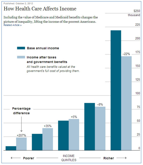
In October 2012, The New York Times published an interactive graph on their website comparing a person’s income before and after considering the person’s taxes and health care benefits. Click on the image to access the article.
Data are frequently displayed in graphs in the media to make it easier to visualize what a set of numbers actually means. Different data displays are used for different purposes.
- Bar graphs are used to display categorical data so that comparisons may be made between the data values from different categories.
- Line graphs are used to show how data change over time.
- Dot plots are used to show the distribution of a set of data and make decisions about the spread or central tendency of the data set.
- Stem and leaf plots are used to show the distribution of numerical data.
- Circle graphs are used to show how parts of a whole compare to one another, usually using percentages of the whole.
- Histograms are used to show the spread of a set of numerical data using intervals.
- Box and whiskers plots, also called box plots, are used to visually represent five key statistics from a set of data: minimum value, first quartile, median, third quartile, and maximum value.
Data are also used to describe characteristics of a particular population or a group that is being studied. It is usually difficult to survey every member of a population, so frequently a representative sample is used to describe the characteristics of a population. For example, The New York Times reported the following survey that was conducted in 2009. The researchers did not talk to every American resident over the age of 15. Instead, they selected a sample of residents in order to describe the entire population, or all American residents over the age of 15.
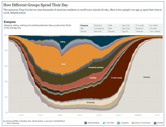
To see the graph as it was in the original interactive, as well as additional graphs from the same survey, click on the above image. (Use Firefox or Internet Explorer as your browser in order to use the interactive.)
In this lesson, you will investigate how a random sample can be used to describe a population. You will also look at different ways that valid conclusions can be drawn from a set of data that is displayed in a visual format such as a table or a graph.
Samples and Populations
Trees and forests are important to the ecology of any town, city, or state. Urban planners need to know about the different trees present in a city to make sure there is enough green space to promote recreation. Foresters need to know about the types of trees in a forest to combat outbreaks of disease and other pests that harm forests.
 In this section, you will use sampling techniques in order to describe a neighborhood forest.
Susana wants to know what types of trees and how many of each type are in her neighborhood. Instead of counting every tree in the neighborhood, Susana randomly selected 25 houses out of the 240 in her neighborhood to survey the types of trees.
Use the interactive below to determine the number of each of the four types of trees that Susana found at the 25 houses. Match the leaf or tree to the number of that type of tree that Susana found. Use the information below to complete the table that follows.
Copy and paste the table below into your notes, and use the information in the interactive to complete the table.
|
Type of Tree
|
Number of Trees
|
|
White Oak
|
|
|
Cedar Elm
|
|
|
Loblolly Pine
|
|
|
Pecan
|
|
Click here to check your answer.
Now that Susana has completed her survey, she is ready to use it to make predictions about the population of trees in her neighborhood.
Susana can set up and solve a proportion relating the ratio of each type of tree in her sample to the ratio of each type of tree in her neighborhood.
Watch the video below to see how Susana set up and solved a proportion to determine the number of white oak trees in her entire neighborhood. (Note: There is no audio in the video.)
Use what you have seen so far to answer the following questions.
- Based on the data that Susana collected, how many pecan trees are there in her neighborhood?
- Based on the data that Susana collected, about how many cedar elm trees are there in her neighborhood?
Pause and Reflect
- When using a sample to make predictions about a population, why is it important to make sure that the sample is representative of the population?
- What is one way you can help to make sure your sample is representative of the population?
Practice
Reginald wanted to know which pet was most popular among seventh graders at his school. He randomly surveyed 60 students during seventh grade lunch. The results of his survey are shown in the graph below. Use this graph to answer questions 1–3.
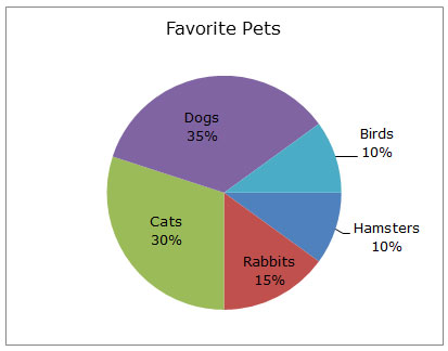
- How many of the students surveyed said that their favorite pet was a cat?
- If there are 340 seventh grade students in Reginald’s school, how many of them should Reginald expect to say that a dog was their favorite pet?
- Of the 340 seventh grade students, how many more would Reginald expect to favor dogs as pets over cats?
Interpreting Graphical Displays of Data: Part-Whole Relationships
 In the last section, you used data from a sample to make predictions about the population. In this section, you will use the data presented in graphs to determine if particular conclusions can be made.
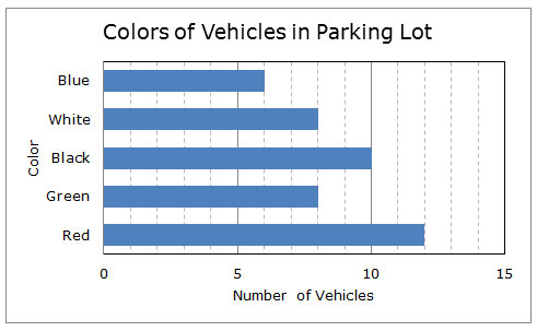
Cynthia wanted to know what colors of vehicles the teachers at Northside Middle School drive. So she went to the first row in the teachers’ parking lot and counted the number of different vehicle colors. The data she collected are shown in the bar graph below.
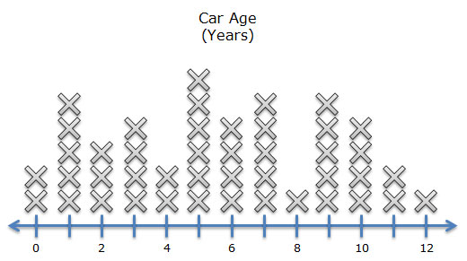
 Jacob thought that Cynthia’s car color study was interesting, so he went into the same row of the teachers’ parking lot to look at the age of each car. Jacob determined the car’s age by subtracting the year the car was made from the current year. He represented his data in the dot plot shown below.
Pause and Reflect
- How can you use a bar graph to make comparisons of one category compared to the whole set of data represented in the graph?
- How is a bar graph like a dot plot? How are they different?
Practice
For questions 1 and 2, the graph below shows how different sources were used to generate electricity in Texas during 2010.

Determine whether or not each of the following statements can be supported from the information in the graph.
For questions 3 and 4, the box-and-whiskers plot, or box plot, shown below represents the average monthly low temperatures and high temperatures in San Antonio, Texas.

Data Source: www.weather.com
Determine whether or not each of the following statements can be supported from the information in the graph.
Summary
In this lesson, you used data collected from a random sample to make predictions about a population. You also saw different graphical representations of data and used those representations to determine whether or not given conclusions were valid.
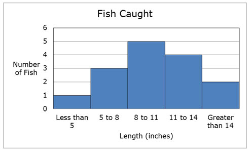
The graph shown below displays data that Brendan and Emily collected from a recent fishing trip. They caught 15 fish and made the graph showing the lengths of the fish that they caught.