Introduction

Graphs and charts are important ways to visualize data. They provide people with a way to interpret and make sense of data at a quick glance without having to make calculations.
A variety of people use graphs and charts to communicate information. Journalists use graphs to visually portray economic data, civic data, demographic data, and other important statistics. Advertisers also use graphs to convince people to spend money on a particular cause or product.
However, graphs and charts can sometimes be misleading. A community newspaper featured the article shown below in a recent edition.
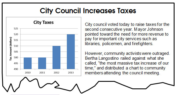
Compare the bar representing the city taxes for 2011 to the bar representing the city taxes for 2013. At first glance, it seems like the 2013 city taxes are substantially higher than the 2011 city taxes.
Take a closer look at the graph appearing in the newspaper article. The actual dollar increase from 2011 city taxes to 2013 city taxes is $20. This may or may not be a significant increase in city taxes.
In this lesson, you will investigate different ways that graphs can cause people to make invalid conclusions. You will also study ways to become more savvy consumers of data and analyze whether a given conclusion is supported by data presented in a graph or a table.
Evaluating Conclusions from Numerical Data
 Each year, actors, actresses, directors, producers, and many other talented individuals are nominated for the Academy of Motion Picture Arts and Sciences' Academy Awards, which are also called the Oscars. The table below shows five recent years and the movies each year that received the greatest number of nominations.
|
Academy Award Nominees |
||
|
Year |
Movie |
Number of Nominees |
|
2008 |
No Country for Old Men |
8 |
|
2009 |
The Curious Case of Benjamin Button |
13 |
|
2010 |
Avatar |
9 |
|
2011 |
The King's Speech |
12 |
|
2012 |
Hugo |
11 |
Detra and her brother studied this data and made a list of conclusions. Determine whether or not each of these conclusions is supported by the data in the table.
Practice
 The population of Texas for recent years, according to the U.S. Census Bureau, is shown in the table.
|
Population of Texas |
|
|
Year |
Population (millions) |
|
1950 |
7.7 |
|
1960 |
9.6 |
|
1970 |
11.2 |
|
1980 |
14.2 |
|
1990 |
17.0 |
|
2000 |
20.9 |
|
2010 |
25.1 |
Based on the information presented in the table, decide which of the following conclusions are valid or invalid.
Evaluating Conclusions from Graphical Data
In addition to seeing data in tables, you will also see data presented in graphical form. Consider the bar graph below, which shows the total number of Olympic gold medals earned by United States athletes in different events from 1896 to 2010.
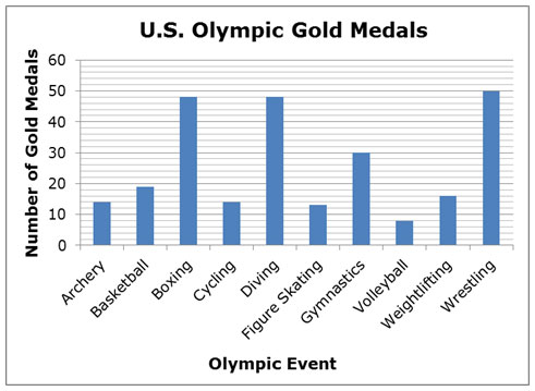
It is important to note that there are events, such as track and field events or swimming events, in which athletes representing the United States have earned well over 300 gold medals. This graph represents a small portion of the total events sponsored by the Olympic Games.
In addition to interpreting graphical information by reading the graph and performing calculations using the data, the structure of the graph could cause misleading conclusions.
The line graph below shows the amount of city taxes paid by the Langostino family for the tax years 2010 through 2013. The graph was provided by their city with the city tax bill.
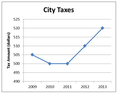
Mrs. Langostino studied this graph and carefully considered each of the following conclusions. Help her decide if the conclusions are valid or invalid, based only on the information in the graph.
- The city taxes are too high.
- City taxes for 2013 are double what they were in 2011.
- City taxes increased from 2011 to 2012 at the same rate as they did from 2012 to 2013.
- City taxes have increased by 4% from 2011 to 2013.
Practice
The histogram below shows the weight of each of the pitchers for the 2012 Houston Astros.
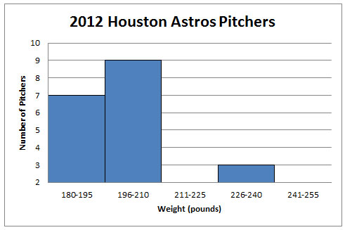
Based on the information presented in the graph, decide which of the following conclusions are valid or invalid.
Summary
In this lesson, you have studied tables of data and graphs to determine whether or not they support given conclusions.
- Statistical measures such as mean, median, or mode
- Rates of change
- Comparisons between numbers
- Percent increases or percent decreases

In a graph, you can use the properties or attributes of the graph to help you analyze the information and decide whether or not a conclusion is valid.
- What numerical values are represented in the graph?
- What values are represented on each axis?
- What is the data interval on each axis?
Knowing how to critically examine a graph will help you become a better consumer of data, since you will know how to look more closely at the numbers being portrayed in the graph to make sure that the conclusions are valid. You’ll never be able to watch the news, read the newspaper, or look at an advertisement the same way again!