Test Prep for AP® Courses
Students analyze pollen grains and fern spores recovered from sediments taken below and above the Cretaceous-Paleogene boundary. Their results are summarized in the graph.
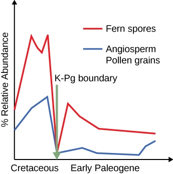
- The mass extinction event reduced only the angiosperms.
- Based on their reduced pollen counts found in the samples, the mass extinction event clearly reduced the number of ferns and angiosperms.
- The mass extinction affected only the ferns.
- Ferns were more abundant after the Cretaceous-Paleogene (K-Pg) mass extinction than before.
Analyze the graph.
What are the reasons for the fern spike seen in the early Paleogene, considering ferns were the first plants seen on the ground after the volcanic eruption of Krakatoa and Mt. St. Helens? Propose reasons for the observed increase in fern spores following the mass extinction.
- Ferns are considered early colonizers as they grow fast on poor soil and reproduce rapidly. Also, mass extinction gave an opportunity for the surviving species to expand and radiate to occupy vacated niches.
- Ferns, having a selective advantage of being early colonizers, grew fast on poor soil and reproduced rapidly, thus permanently replacing angiosperms in the landscape.
- Ferns are considered early colonizers as they grow fast on poor soil and reproduce rapidly. The mass extinction barely lowered their numbers due to their resilience.
- Most of the fern varieties became extinct, only a single species survived; therefore, the remaining fern spores had many vacated niches to occupy which lead to an increase in fern numbers.
A group of students summarized information on five great extinction events. The students are sampling a site in search of fossils from the Devonian period. Based on the chart, what would be the most reasonable plan for the students to follow?

- Searching horizontally rock layers in any class of rock and trying to find those that contain the greatest number of fossils.
- Collecting fossils from rock layers deposited prior to the Permian period that contain some early vertebrate bones.
- Looking in sedimentary layers next to bodies of water in order to find marine fossils of bivalves and trilobites.
- Using relative dating techniques to determine the geological ages of the fossils so they can calculate the rate of speciation of early organisms.
Students are sorting fossils of angiosperm pollen grains, some recovered from layers below the Cretaceous-Paleogene boundary and some from layers above the Cretaceous-Paleogene boundaries. The pollen grains are sorted by morphology. The results are summarized in a table.

Can you explain the results?
- The mass extinction that took place at the Cretaceous-Paleogene boundaries reduced the total number of organisms, shown by the presence of fewer shapes of pollen grains, and led to a loss of diversity, shown by the lower number of grains.
- The mass extinction that took place at the Cretaceous-Paleogene boundaries reduced the total number of organisms, shown by the presence of fewer pollen grains, and led to a loss of diversity, as shown by the presence of fewer shapes.
- The mass extinction that took place at the Cretaceous-Paleogene boundaries reduced the total number of organisms, shown by the lower number of pollen grains, but did not affect diversity.
- The mass extinction that took place at the Cretaceous-Paleogene boundaries led to a loss of diversity, shown by the presence of fewer shapes of pollen grains, but did not affect the total number of organisms.
A dig in a farmland soil rich in calcium carbonate reveals numerous shells of bivalves, chips of corals, the partial imprint of a trilobite, and a few vertebrae dated to 250 million years ago. The table of extinction summarizes information on the five major extinction events.
According to the table of extinction, which conclusion about the fossils is most reasonable?
- The trilobites were the first animals to conquer land.
- The rocks can be dated to the end of the Cretaceous period.
- The farmland was probably part of the seafloor in the Permian period.
- The fossils can be dated to the Ordovician period.
The average temperatures varied during the Pleistocene as glaciation periods were followed by warm intervals. Using the graph and your existing knowledge, what happened to woolly mammoths and other cold-adapted megafauna 10,000 years ago to cause their extinction?

- Habitat destruction due to varying temperatures and over-hunting by humans leading to their extinction.
- Sudden increase in temperature and over-hunting by humans leading to their extinction.
- Gradual increase in temperature and over-hunting by humans leading to their extinction.
- Sudden increase in temperature and in predation by larger mammals leading to their extinction.
In winter, lichens are the only food for the caribou herds that roam the tundra. As the average temperatures increase with climate change, the lichens are gradually being replaced by shrubs and trees in the southern parts of the tundra. The graph illustrates the changes in abundance of lichens and caribou over time in a regional forest of Canada.

A line labeled Caribou begins about halfway up the y-axis at year 1970 and decreases along with the Lichen graph to a point only slightly above the x-axis at year 2000. Which statement best explains the changes in the caribou population between 1975 and 1980?
- The caribou population expanded after the population of lichens dropped.
- The decline of the caribou population and the lichen population are not related.
- The population of caribou decreased following the drop in lichen availability.
- The caribou population was eliminated once the lichens decreased.
A chain within the food web in the Arctic Ocean is shown below:
Phytoplankton ─> zooplankton ─> arctic char/cod ─> ringed seal─> polar bear. A chain within the arctic food web on land is shown below: Lichen/shrub ─> Caribou/hare/small rodent ─> fox/lynx/bird of prey
If polar bears move to land to hunt due to loss of sea ice, what will happen to the balance of the food web?
- Polar bears, being top predators, will edge out the other consumers without gaining enough calories themselves.
- Polar bears, being secondary consumers, will edge out the other consumers without gaining enough calories themselves.
- Polar bears, being top predators, will edge out the producers without gaining enough calories themselves.
- Polar bears, being secondary consumers, will edge out the producers without gaining enough calories themselves.
Historically, the Atlantic Ocean off Canada and the northeast United States has been some of the richest and most popular fishing grounds. Huge factory ships developed in the 1960s converged on the region from all over the world, attracted by the rich catches. The graph represents the population of cod in recent years.

Based on the graph, what is the likely explanation for the collapse of the northwest cod?
- A tropical disease decimated the populations of cod.
- Overfishing led to the collapse of the cod population.
- The cod population migrated somewhere else.
- The cod population is going through its cycle of rise and fall.
The graphs show the changes in the human population and the rate of extinction.


Which statement most likely explains how the increase in human population could lead to a decrease in biodiversity?
- Every human added to the planet replaces a different species of organism.
- The more people inhabiting the planet, the more the average temperature increases, causing loss of other species.
- With the increase in population the demands for land, water, food, and energy increase, leading to the destruction of habitat.
- Increases in human population reduce the amount of land available for use by all species.